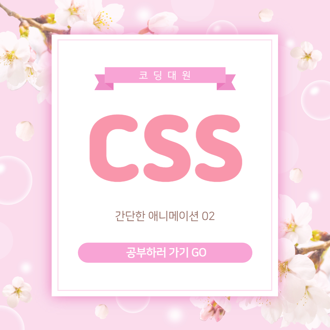
간단한 애니메이션 02
간단한 애니메이션 만들기 두번째 시간입니다.
빙글빙글 돌아가는 조그만 두개의 공을 만들어보겠습니다.
01. HTML
{
    <div class="loading">
    <span class="circle1"></span>
    <span class="circle2"></span>
  </div>
}
02. CSS
{
    body {
        height: 100vh;
        background-image: linear-gradient(-60deg, #ff5850 0%, #f09819 100%)
      }
      .loading {
        position: absolute;
        left: 50%;
        top: 50%;
        width: 20px;
        height: 150px;
        background: transparent;
        animation: loading 1s ease infinite;
      }
      .loading .circle1 {
        display: block;
        width: 20px;
        height: 20px;
        border-radius: 50%;
        background: #fff;
      }
      .loading .circle2 {
        display: block;
        width: 20px;
        height: 20px;
        border-radius: 50%;
        background: #fff;
        margin-top: 110px;
      }
      @keyframes loading {
        0%{transform: translate(-50%, -50%) rotate(0deg)}
        100%{
          transform: translate(-50%, -50%) rotate(360deg)}
      }
}
03. 결과물
'CSS' 카테고리의 다른 글
| SVG Intro (5) | 2022.09.07 |
|---|---|
| 간단한 애니메이션 03 (2) | 2022.09.02 |
| 간단한 애니메이션 01 (5) | 2022.08.29 |
| 요소 숨기기 (8) | 2022.08.25 |
| 색상 표현 방법 (3) | 2022.08.23 |


댓글